Mixed Metro
Mapping neighborhood racial diversity and segregation in the USA
Photo by Flickr user Mario Bollini

Visualizing Neighborhood Change
Ribbon Charts
Ribbon charts for the 20 largest US metro areas and all MSAs, showing transitions among tract types over three decades:
| Low Diversity White
| Low Diversity Black
| Low Diversity Asian
| Low Diversity Latinx
| Moderate Diversity White
| Moderate Diversity Black
| Moderate Diversity Asian
| Moderate Diversity Latinx
| High Diversity

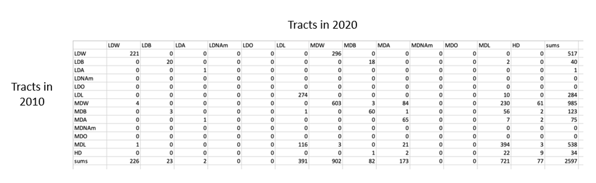
Transition Matrices
Transition matrices for the 100 largest US metro areas and all 50 states plus Washington DC, showing transitions among tract types over three decades (rows=from; columns=to)
Example Transition Matrix